The Human-Centered Design Approach
In my recent article 'Why You Should Thank Leonardo da Vinci - An Overview of User Experience (UX) Design', I took a look at the origin of UX design, the progression over time and then how it can be broke down into its simplest elements. This article builds on these concepts by outlining some of the steps used to conduct a human-centered design project. All thoughts, views and comments are my own.
Introduction
HCD is a creative approach to solving problems by involving the users perspective at every point along the journey. By implementing this approach and focusing on the user, the aim is to end up with an innovative solution that has been designed specifically to meet the demands of the user.
“Human-centered design is all about building a deep empathy with the people you’re designing for; generating tons of ideas; building a bunch of prototypes; sharing what you’ve made with the people you’re designing for; and eventually putting your innovative new solution out in the world.” [DesignKit, 2014]
The following are some steps that can be taken to ensure that the end-user is at the core of the design decision process.
Problem Identification
The identification of the problem is the first and foremost step in any research process. The Kenya Projects Organisation states research as a problem or unclear situation “which a researcher experiences in practical or theoretical context and wants to obtain a tangible explanation, clarification or offer solution to it” [Kenpro, 2012]. When it comes to designing an interface, the user experience is a fundamental ingredient to the survival length for the associated subject matter (e.g. application, lift/elevator, ATM machine). During the problem identification phase, it is imperative to identify areas that can be improved, and as a result, create an enriched user experience, enabling the interface to appeal to more users.
Figure 1: Problem Identification
Problem Justification
Figure 2: Problem Justification
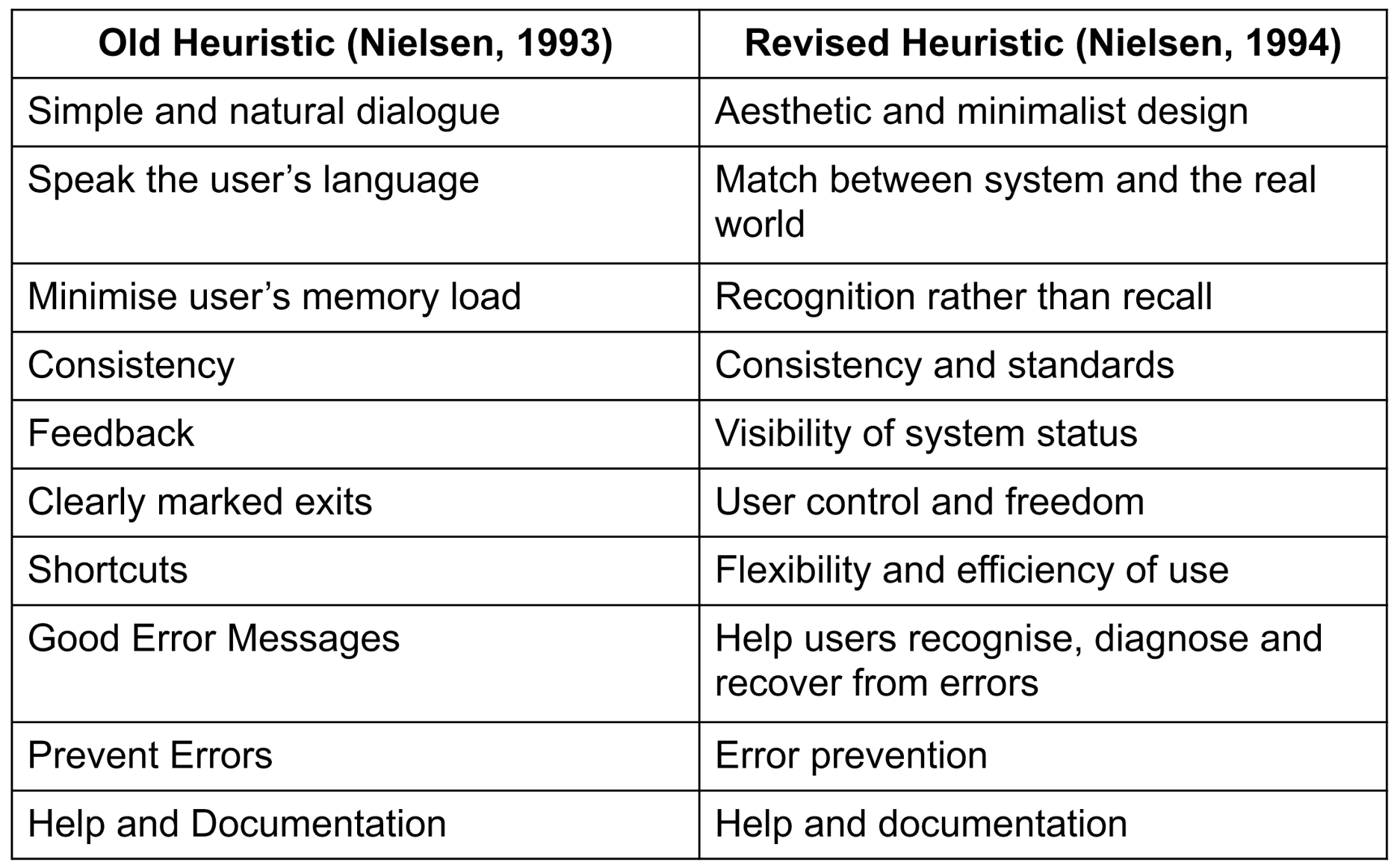
Albert Einstein is attributed to saying that if he had one hour to solve a problem, he would spend the first 55 minutes defining the problem and the last 5 minutes thinking about the solutions. The justification of the problem is a critical phase in any process to ensure that all aspects of the problem have been thought about, justifying the need for a solution. One approach to verifying the problem statement is to perform a heuristic evaluation. This involves performing a usability inspection to identify problems based on compliance with recognised usability principles. One of the best known sources and most widely used set of heuristics are the ten proposed by Jakob Nielsen. These are based on an analysis of 249 usability problems.
Figure 3 Nielsen's Heuristics
1. Aesthetic and Minimalist Design
“Dialogues should not contain information which is irrelevant or rarely needed. Every extra unit of information in a dialogue competes with the relevant units of information and diminishes their relative visibility” [Nielson, J., 1995].
2. Match Between System and Real World
“The system should speak the users' language, with words, phrases and concepts familiar to the user, rather than system-oriented terms. Follow real-world conventions, making information appear in a natural and logical order” [Nielson, J., 1995].
3. Recognition Rather Than Recall
It is widely known that when it comes to the human memory, the performance of memory recognition is far greater than the performance of memory recall. The reason for this is based on the fact that there is a greater amount of cues that can help memory retrieval when it comes to recognition rather than recall. In the 'Psychology of Everyday Things', Norman looks at the cognitive load on memory when it comes to the concept of 'Knowledge in the head and in the world' [Norman, D. A., 1988].
“Minimize the user's memory load by making objects, actions, and options visible. The user should not have to remember information from one part of the dialogue to another. Instructions for use of the system should be visible or easily retrievable whenever appropriate” [Nielson, J., 1995].
4. Consistency and Standards
When it comes to designing an interface, visual consistency and standards play a vital role for a number of reasons. It increases the usability which will in turn attract and maintain users. It makes it easy for uses to access the most important information in a quick and intuitive manner. Finally, consistency evokes a strong emotional response [Anić, I., 2015]. There are a number of different ways to achieve this consistency from using similar colours, providing navigation menus and using similar icons, links and form elements throughout the site [Lacey Tech Solutions, 2013].
“Users should not have to wonder whether different words, situations, or actions mean the same thing” [Nielson, J., 1995].
5. Visibility of System Status
The system status and feedback give the user an indication on the progress and completion of their actions. The system status can include the current location within the application, the progress towards completion and also the time needed for a task to be completed [UTHealth, 2016].
“The system should always keep users informed about what is going on, through appropriate feedback within reasonable time” [Nielson, J., 1995].
6. User Control and Freedom
It's essential that a user feels in control during their experience of using an interface. If they should land on a page and want to return to where they came from, there should be clear navigation options regardless of where they reside within the system. If there are no clear signs on navigation, they will most likely become frustrated with their poor experience of using the application and proceed to an alternate choice.
“Users often choose system functions by mistake and will need a clearly marked "emergency exit" to leave the unwanted state without having to go through an extended dialogue. Support undo and redo” [Nielson, J., 1995].
7. Flexibility and Efficiency of Use
“Accelerators -- unseen by the novice user -- may often speed up the interaction for the expert user such that the system can cater to both inexperienced and experienced users. Allow users to tailor frequent actions” [Nielson, J., 1995].
8. Help Users Recognise, Diagnose and Recover From Errors
“Error messages should be expressed in plain language (no codes), precisely indicate the problem, and constructively suggest a solution” [Nielson, J., 1995].
9. Error Prevention
Providing the user with feedback if errors should occur is an important part of gaining trust with the user at times of unusual circumstances. This feedback should be informative and explain to the user what has happened and how to resolve the potential issue.
“Even better than good error messages is a careful design which prevents a problem from occurring in the first place. Either eliminate error-prone conditions or check for them and present users with a confirmation option before they commit to the action” [Nielson, J., 1995].
10. Help and Documentation
“Even though it is better if the system can be used without documentation, it may be necessary to provide help and documentation. Any such information should be easy to search, focused on the user's task, list concrete steps to be carried out, and not be too large” [Nielson, J., 1995].
Affinity/Empathy Mapping
Figure 4: Affinity/Empathy Mapping
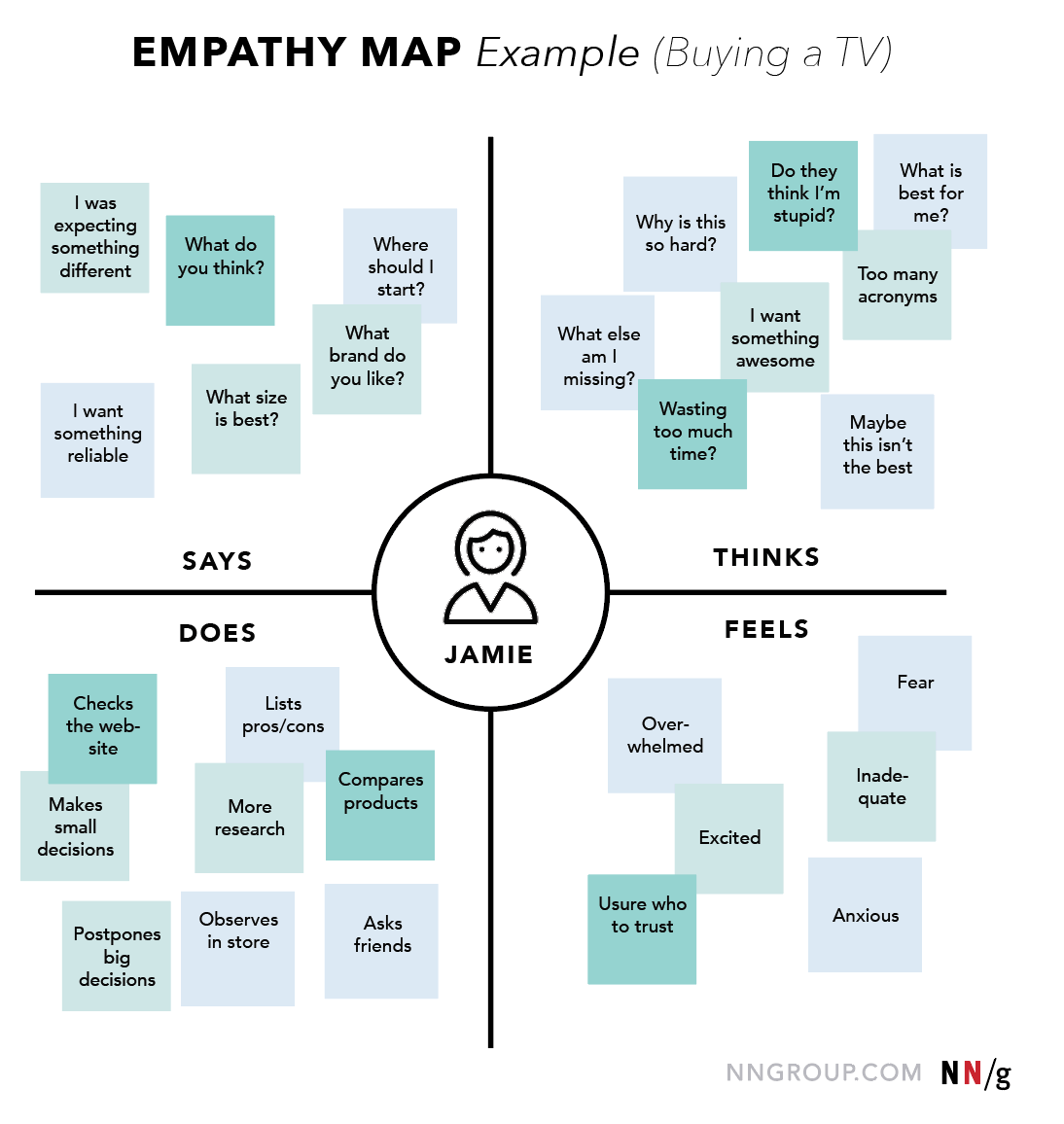
An affinity diagram is a powerful technique that can be used to sort and group large amounts of data in order to visualise and understand it more effectively. The process is quite simple and straightforward requiring each user to write terms related to how they feel a user interacts with the interface. These terms should be aligned to a number of categories, combined and grouped obtaining a consensus on how the interface information should be structured and displayed [InfoDesign, 2016].
Figure 5: Affinity/Empathy Mapping Example
Proto-Persona Creation
Figure 6: Proto-Persona Creation
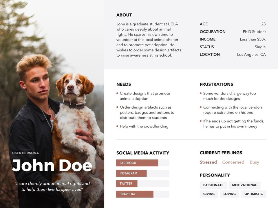
Proto-personas are a great way to ensure that design decisions are based on an educated guess to who the end users for the interface is designed for [Ilama, E., 2015]. It's also an excellent way to redirect the focus throughout the project, from the interface to the end user, ensuring that at every stage, all the correct design and functionality decisions are made [Summers, B., 2016].
Figure 7: Proto-Persona Example
User Research - Questionnaire
In UX, questionnaires are a relatively quick and cheap way to gather information on the users "preferences, attitudes, characteristics and options" when it comes to understanding what the user is looking for, how they would most likely use and what the most important aspects of an interface would be [Gray, 2014]. This information is extremely beneficial for designers when working on implementing prototypes to provide the required functionality. The information obtained from these questionnaires and surveys relate to a subset of a population, the learnings of which can be then applied to the broader population.
Figure 8: User Research - Questionnaire
User Research - Interviews
Performing an interview after an online survey allows to further clarify and explain the survey answers [Veal, R., 2016]. When preparing for the interviews, it is important to identify potential user groups and then spend time providing an interview script with an explanation/introduction on why the interview is taking place, along with the main goals and questions that need to be addressed [Mears, C., 2013]. The ideal outcome from the interviews should be to uncover any concerns and misunderstanding from the user by qualitatively discovering a user’s attitude, beliefs and experience towards an interface, whether it be associated with a product or an application, by capturing their emotions and body language [Veal, R., 2016].
Figure 9: User Research - Interviews
User Research - Observation
While observing a user, it is important to give them some meaningful tasks to perform [Nielsen, N., 2014]. "There's nothing more impactful than seeing people perform their tasks and encounter problems firsthand. Observation promotes empathy for users and the problems they face" [Ross, J., 2012].
Figure 10: User Research - Observation
User Research - Results Filtering
When gathering data from online surveys, interviews and observations, it is vital that this data is then analysed in order to get an overall impression and understanding of the subjects data.
Figure 11: User Research - Result Filtering
Task Descriptions
Figure 12: Task Descriptions
Task descriptions are a great way to incorporate the research data into something tangible, related to the type of users, how they will be interacting with the system and what functionality should be facilitated by the interface [Errity, A. & Reardon, S., 2016]. These task descriptions can be broken down into a number of different elements, each with their own benefits and their own way of gathering and structuring the data obtained from research. Without research, an understanding of your users and proper direction, interfaces increase in the risk of falling into the tyre swing analogy [Ward, J., 2010].
Figure 13: The Tyre Swing Analogy
Typically, the three main activities that fall under task descriptions are; user stories, scenarios and storyboards.
User Stories
A user story is presented in a user-centric way that "encapsulates a need or piece of functionality in the language of the end user, that sums up what the requirement or goal is and the reason for it" [Mears, C., 2013]. User stories originated from the advancement of agile and scrum methodologies, aimed at allowing designers and developers to prioritise and organise how each piece of functionality should be designed and created [Brinton, B., 2015].
Scenarios
A scenario is a narrative story that gives a background to the user and why they are going to visit the interface and "are typically used to provide a picture of the intended user experience" [UXM, 2010].
Storyboards
A storyboard is a sequential flow of images that are used to visualise and bring a vision to life. These are used to provide an overview of a scenario in an engaging way that people can understand [Crothers, B., 2011]. Storyboards help outline any issues that could arise while performing a range of functions, resulting in strengthening the user experience elements of a design [Little, A., 2013].
Persona Creation
A persona, who is referred to as a hypothetical person, is created based on the research data obtained from observing and gathering information from many people. As it is highly unlikely to cater for all types of users in a system, a persona represents a significant portion allowing designers and engineers to focus on creating functionality and implementing design elements aimed at the majority [Goltz, S., 2014].
Personas originate back to the early 80's when Alan Cooper wanted to try and empathise with the users that were using the software that he had designed and created. He understood that in order to be successful and persuade clients, he needed to help clients see the world from the users perspective [Goltz, S., 2014].
Figure 14: Persona Creation
Prototyping
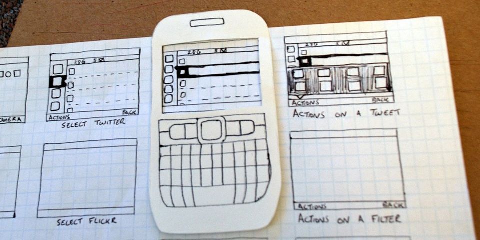
Prototyping allows functionality flow and proposed designs to be tested before going through the entire design process of implementing expensive wire-frames. Users can quickly test ideas and then give feedback based on their interactions with the designed prototypes.
Figure 15: Prototyping
Goals
When it comes to UX, goals are based on the combination of an understanding of the interfaces users along with the business requirements for the interface [Errity, A. & Reardon, S., 2016]. Goals can be split into two contrasting categories, qualitative and quantitative, both of which have their strengths and limitations when used solely without the consideration of the other. Qualitative goals are very much subjective towards emotional based responses, which are extremely useful in guiding initial and iterative design efforts. The feedback obtained from these qualitative goals "tells 'why' at a level that quantitative data cannot reveal" [TryMyUI, 2016]. Quantitative goals are measurable responses that are based on facts and performance. The feedback obtained from these quantitative goals "strengthen and justify qualitative findings" and can be used to "set predictable objectives for a new design sprint" [TryMyUI, 2016].
Figure 16: Goals
Prototype User Testing
Prototypes are used in order to receive user feedback at the early stages of developing an interface in order to assess the viability of a design [UserTesting, 2016]. Feedback can be based on a number of different aspects of the interface including learnability, efficiency of use, memorability, errors and satisfaction [Errity, A. & Reardon, S., 2016]. It is critical to make research-backed, user-centered decisions at the beginning of the process. It is estimated that 50% of engineering time is spent doing rework that could have been avoided [Usability, 2016] and that fixing an error after development has been completed is up to 100 times as expensive as it would have been before [Weinschenk, S., 2011].
Figure 17: Prototype User Testing
Conclusion
The experience a user takes when using an interface is clearly a vital role in the retention rate for that user interface. It is said that if the user interface has not been designed in a way that makes it easy for the user to navigate, find the most important information and interact with the features it provides, they will leave within 15 seconds. By taking a human-centered approach when designing, you can maximise your chance of capturing the user’s attention within 15 seconds and “know that your solution will be a success because you’ve kept the very people you’re looking to serve at the heart of the process.” [DesignKit, 2014].
References
- Anić, I. (2015). The importance of Visual Consistency in UI Design. [ONLINE] Available at: http://www.uxpassion.com/blog/the-importance-of-visual-consistency-in-ui-design/. [Accessed 17 February 2019].
- Brinton, B. (2015). User Stories: A Foundation for UI Design. [ONLINE] Available at: http://www.uxbooth.com/articles/user-stories-a-foundation-for-ui-design/. [Accessed 17 February 2019].
- CrazyEgg (2018). The 15 Second Rule: 3 Reasons Why Users Leave a Website. [ONLINE] Available at: https://www.crazyegg.com/blog/why-users-leave-a-website/. [Accessed 22 February 2019]
- Crothers, B. (2011). Storyboarding & UX – part 1: an introduction. [ONLINE] Available at: http://johnnyholland.org/2011/10/storyboarding-ux-part-1-an-introduction/. [Accessed 17 February 2019].
- DesignKit (2014). What is Human-Centered Design? [ONLINE] Available at: http://www.designkit.org/human-centered-design. [Accessed 22 February 2019]
- Errity, A. & Reardon, S. (2016). Goal Setting. [ONLINE] Available at: https://www.dropbox.com/sh/vp3puz814w7ery4/AAAD8Cj2uFJQ4eZEcFXbp15Ga/Day%204?dl=0&preview=9+-+Goal+Setting.pdf. [Accessed 17 February 2019].
- Errity, A. & Reardon, S. (2016). Task Modelling. [ONLINE] Available at: https://www.dropbox.com/sh/vp3puz814w7ery4/AABa6Y40IGz-6XKh-3VEVBN1a/Day%202?dl=0&preview=5+-+Task+Modelling.pdf. [Accessed 17 February 2019].
- Errity, A. & Reardon, S. (2016). User Testing. [ONLINE] Available at: https://www.dropbox.com/sh/vp3puz814w7ery4/AAAD8Cj2uFJQ4eZEcFXbp15Ga/Day%204?dl=0&preview=10+-+User+Testing.pdf. [Accessed 17 February 2019].
- Figure 1: Problem Identification. http://www.hdwallpapers.in/walls/wall_e__rubiks_cube-wide.jpg
- Figure 2: Problem Justification. http://answersafrica.com/wp-content/uploads/2015/07/shutterstock_Symbol-of-law-and-justice-1.jpg
- Figure 3: Nielsen's Heuristics. https://www.dropbox.com/sh/vp3puz814w7ery4/AACoNXCA_HtBWtjW1VhO_qIBa/Day%203/8%20-%20Heuristic%20Evaluation.pdf?dl=0
- Figure 4: Affinity/Empathy Mapping. https://www.dialog-direct.com/atlas/wp-content/uploads/2015/04/paper-chain-people2.jpg
- Figure 5: Affinity/Empathy Mapping Example. https://media.nngroup.com/media/editor/2017/11/07/screen-shot-2017-11-07-at-74041-am.png
- Figure 6: Proto-Persona Creation. https://static1.squarespace.com/static/52737a77e4b08d0d31723765/52b01c1fe4b0880660ab27c9/57616b2a2eeb8180041b277f/1474466738411/Persona-3.jpg?format=1500w
- Figure 7: Proto-Persona Example. https://venngage-wordpress.s3.amazonaws.com/uploads/2018/03/user-persona-examples-8.jpg
- Figure 8: User Research - Questionnaire. http://www.boostbusinesssupport.com/wordpress/wp-content/uploads/2012/09/Questionnaire1.jpg
- Figure 9: User Research - Interviews. http://i.huffpost.com/gen/1641782/images/o-JOB-INTERVIEW-facebook.jpg
- Figure 10: User Research - Observation. https://aos.iacpublishinglabs.com/question/aq/1400px-788px/systematic-observation-psychology_62ca7bb505ed13ff.jpg?domain=cx.aos.ask.com
- Figure 11: User Research - Result Filtering. https://www.collegeboard.org/sites/default/files/images/Home_Illustration_1.png
- Figure 12: Task Descriptions. http://blog.appliedinformaticsinc.com/wp-content/uploads/2015/07/plan-well.jpg
- Figure 13: The Tyre Swing Analogy. http://www.tamingdata.com/2010/07/08/the-project-management-tree-swing-cartoon-past-and-present/
- Figure 14: Persona Creation. http://www.studioone.com/wp-content/uploads/2015/06/Buyer-Persona.jpg
- Figure 15: Prototyping. https://s-media-cache-ak0.pinimg.com/originals/af/2e/4e/af2e4e2856886b5b6f4bf5c30562c2a5.jpg
- Figure 16: Goals. https://assets-production-webvanta-com.s3-us-west-2.amazonaws.com/000000/49/06/original/archives/images/dart-targets.jpg
- Figure 17: Prototype User Testing. http://help.usertesting.com/customer/portal/articles/1742260-prototype-testing
- Goltz, S. (2014). A Closer Look At Personas: What They Are And How They Work (Part 1). [ONLINE] Available at: https://www.smashingmagazine.com/2014/08/a-closer-look-at-personas-part-1/. [Accessed 17 February 2019].
- Gray (2014). Better User Research Through Surveys. [ONLINE] Available at: http://uxmastery.com/better-user-research-through-surveys/. [Accessed 17 February 2019].
- Ilama, E. (2015). Creating Personas. [ONLINE] Available at: http://www.uxbooth.com/articles/creating-personas/. [Accessed 17 February 2019].
- Kenpro (2012). Topic Identification. [ONLINE] Available at: http://www.kenpro.org/topicidentification.htm. [Accessed 17 February 2019].
- InfoDesign (2016). Affinity diagramming. [ONLINE] Available at: http://infodesign.com.au/usabilityresources/affinitydiagramming/. [Accessed 17 February 2019].
- Lacey Tech Solutions (2013). Why is consistency important in Web Design? [ONLINE] Available at: https://laceytechsolutions.co.uk/blog/importance-of-consistency-in-web-design/. [Accessed 17 February 2019].
- Little, A. (2013). Storyboarding in the Software Design Process. [ONLINE] Available at: https://uxmag.com/articles/storyboarding-in-the-software-design-process. [Accessed 17 February 2019].
- Mears, C. (2013). User Interviews – The Beginner's Guide. [ONLINE] Available at: http://theuxreview.co.uk/user-interviews-the-beginners-guide/. [Accessed 17 February 2019].
- Nielsen, N. (2014). Turn User Goals into Task Scenarios for Usability Testing. [ONLINE] Available at: https://www.nngroup.com/articles/task-scenarios-usability-testing/. [Accessed 17 February 2019].
- Nielson, J. (1995). 10 Usability Heuristics for User Interface Design. [ONLINE] Available at: https://www.nngroup.com/articles/ten-usability-heuristics/. [Accessed 17 February 2019]
- Norman, D. A. (1988). The Design of Everyday Things. New York: Doubleday. ISBN: 0-385-26774-6. Call Number: TS171.4 .N67 1990.
- Ross, J. (2012). Observing User Research. [ONLINE] Available at: http://www.uxmatters.com/mt/archives/2012/08/observing-user-research.php. [Accessed 17 February 2019].
- Summers, B. (2016). How to Make Proto-Personas and Get Everyone on the Same Page. [ONLINE] Available at: http://www.dtelepathy.com/blog/philosophy/how-to-make-proto-pesonas. [Accessed 17 February 2019].
- TryMyUI (2016). Quantitative and Qualitative Testing. [ONLINE] Available at: http://www.trymyui.com/quantitative-and-qualitative-testing. [Accessed 17 February 2019].
- UTHealth (2016). Provide Informative Feedback. [ONLINE] Available at: https://sbmi.uth.edu/nccd/ehrusability/design/guidelines/Principles/feedback.htm. [Accessed 17 February 2019].
- UXM (2010). A step by step guide to scenario mapping. [ONLINE] Available at: http://www.uxforthemasses.com/scenario-mapping/. [Accessed 17 February 2019].
- Veal, R. (2016). How To Conduct User Experience Research Like A Professional. [ONLINE] Available at: http://blog.careerfoundry.com/ux-design/how-to-conduct-user-experience-research-like-a-professional. [Accessed 17 February 2019].
- Ward, J. (2010). The Project Management Tree Swing Cartoon, Past and Present. [ONLINE] Available at: http://www.tamingdata.com/2010/07/08/the-project-management-tree-swing-cartoon-past-and-present/. [Accessed 17 February 2019].
- Weinschenk, S. (2011). The ROI of User Experience. [ONLINE] Available at: https://www.youtube.com/watch?v=O94kYyzqvTc#t=11. [Accessed 17 February 2019].


